Button
Examples
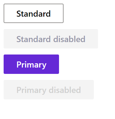
Basic buttons
- Python
- PowerShell
import pglet
from pglet import Button
with pglet.page("basic-buttons") as page:
  page.add(
    Button("Standard"),
    Button("Standard disabled", disabled=True),
    Button("Primary", primary=True),
    Button("Primary disabled", primary=True, disabled=True))
# TODO
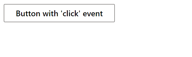
Button with click event
- Python
- PowerShell
import pglet
from pglet import Button, Text

with pglet.page("button-with-click-event") as page:

    def button_clicked(e):
        b.data += 1
        t.value = f"Button clicked {b.data} time(s)"
        page.update()

    b = Button("Button with 'click' event", on_click=button_clicked, title='Click me!', data=0)
    t = Text()

    page.add(b, t)

    input()
# TODO
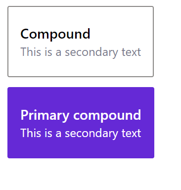
Compound buttons
- Python
- PowerShell
import pglet
from pglet import Button
with pglet.page("compound-buttons") as page:
    page.add(
      Button("Compound", secondary_text='This is a secondary text', compound=True),
      Button("Primary compound", secondary_text='This is a secondary text', compound=True, primary=True))
# TODO
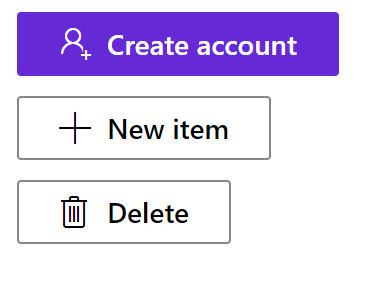
Buttons with icons
- Python
- PowerShell
import pglet
from pglet import Button
with pglet.page("buttons-with-icons") as page:
page.add(
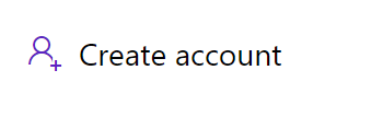
Button("Create account", icon='AddFriend', primary=True),
Button("New item", icon='Add'),
Button("Delete", icon='Delete'))
# TODO
Icon only buttons
- Python
- PowerShell
import pglet
from pglet import Button
with pglet.page("icon-only-buttons") as page:
  page.add(
    Button(icon='Emoji2', title='Emoji!'),
    Button(icon='Calendar', title='Calendar!'))
# TODO
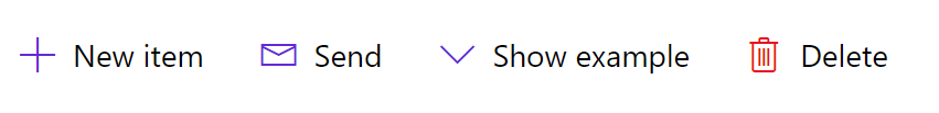
Toolbar buttons
- Python
- PowerShell
import pglet
from pglet import Button, Stack
with pglet.page("toolbar-buttons") as page:
    page.add(Stack(horizontal=True, controls=[
      Button(text="New item", toolbar=True, icon='Add'),
      Button(text="Send", toolbar=True, icon='Mail'),
      Button(text="Show example", toolbar=True, icon='ChevronDown'),
      Button(text="Delete", toolbar=True, icon_color='red', icon='Delete')
    ]))
# TODO
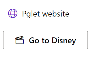
Link buttons
- Python
- PowerShell
import pglet
from pglet import Button
with pglet.page("link-buttons") as page:
  page.add(
    Button(action=True, icon='Globe', text='Pglet website',url='https://pglet.io', new_window=True),
    Button(icon='MyMoviesTV', text='Go to Disney', url='https://disney.com', new_window=True))
# TODO
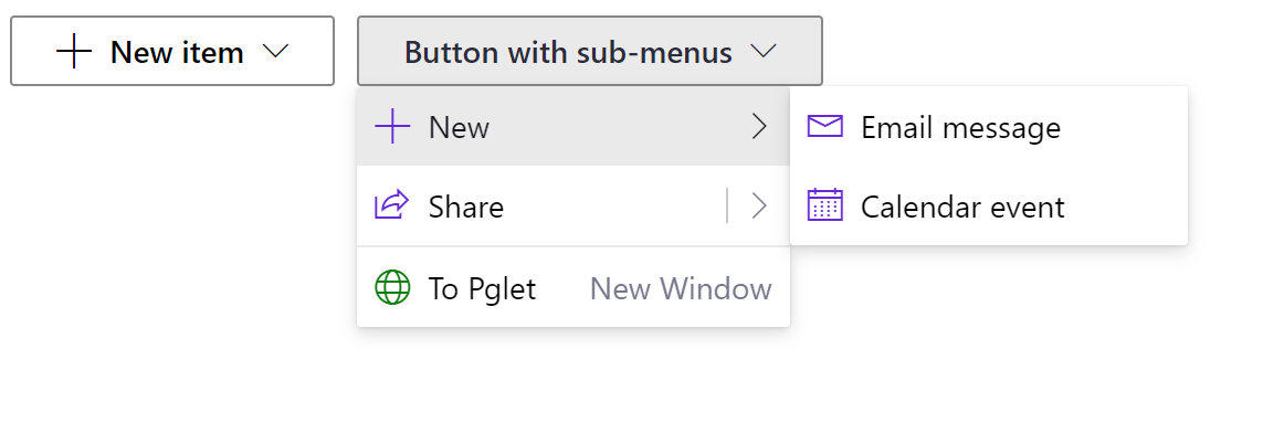
Context menu buttons
- Python
- PowerShell
import pglet
from pglet import Button, Stack, button
with pglet.page("context-menu-buttons") as page:
  page.add(Stack(horizontal=True, controls=[
    Button(icon='Add', text='New item', menu_items=[
      button.MenuItem(text='Email message', icon='Mail'),
      button.MenuItem(text='Calendar event', icon='Calendar')
    ]),
    Button(text='Button with sub-menus', menu_items=[
      button.MenuItem(text='New', icon='Add', sub_menu_items=[
      button.MenuItem(text='Email message', icon='Mail'),
      button.MenuItem(text='Calendar event', icon='Calendar')
    ]),
      button.MenuItem(text='Share', icon='Share', split=True, sub_menu_items=[
        button.MenuItem(text='Share to Twitter'),
        button.MenuItem(text='Share to Facebook'),
        button.MenuItem('Share to Somewhere'),
        button.MenuItem('Share to email', sub_menu_items=[
          button.MenuItem('Share to Outlook'),
          button.MenuItem('Share to Gmail')
        ])
      ]),
      button.MenuItem(divider=True),
      button.MenuItem(text='To Pglet', icon='Globe', icon_color='green', url='https://pglet.io', new_window=True, secondary_text='New Window')
    ]),
  ]))
# TODO
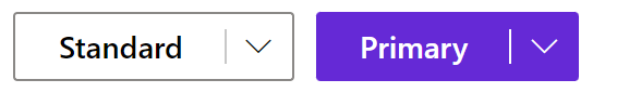
Split buttons
- Python
- PowerShell
import pglet
from pglet import Button, Stack, button
with pglet.page("split-buttons") as page:
  page.add(Stack(horizontal=True, controls=[
    Button(split=True, text='Standard', menu_items=[
      button.MenuItem('Email message', icon='Mail'),
      button.MenuItem('Calendar event', icon='Calendar')
    ]),
    Button(split=True, primary=True, text='Primary', menu_items=[
      button.MenuItem('Email message', icon='Mail'),
      button.MenuItem('Calendar event', icon='Calendar')
    ])
  ]))
# TODO
Action buttons
- Python
- PowerShell
import pglet
from pglet import Button, Stack
with pglet.page("action-button") as page:
  page.add(Stack(horizontal=True, controls=[
    Button(action=True, icon='AddFriend', text='Create account')
  ]))
# TODO
Properties
| Name | Type | Default | Description |
|---|---|---|---|
primary | bool | false | The button with a theme color background. Usually, there is only one primary button on a form. |
compound | bool | false | Render compound button with primary and secondaryText on a second line. |
action | bool | false | Render button as a link without a border. |
toolbar | bool | false | Render toolbar-like button. |
split | bool | false | If set to true, and if menu items are provided, the button will render as a SplitButton. |
focused | bool | false | When set to true the focus is set on the control when it's shown on the page or page opened. |
text | string | The text displayed on a button. | |
secondaryText | string | Description of the action this button takes. Only used for compound buttons. | |
url | string | If provided, the button will be rendered as a link. | |
newWindow | bool | false | Whether to open link in a new browser window. |
title | string | Popup hint for the button. | |
icon | string | Icon shown in the button. | |
iconColor | string | Icon color. | |
data | string | Additional data attached to the control. The value is passed in click event data. |
Events
| Name | Description |
|---|---|
click | Fires when a user clicks the button. |
focus | Fires when the control has received focus. |
blur | Fires when the control has lost focus. |
Child controls
Item control
Represents a menu item within a context menu button.
Properties
| Name | Type | Default | Description |
|---|---|---|---|
text | string | Text of the menu item. If a standard hyphen (-) is passed in, then the item will be rendered as a divider. If a dash must appear as text, use an emdash (—), figuredash (‒), or minus symbol (−) instead. | |
secondaryText | string | Seconday description for the menu item to display. | |
url | string | URL to navigate to for this menu item. | |
newWindow | bool | false | Whether to open link in a new browser window. |
icon | string | An optional icon to display next to the item. | |
iconColor | string | Icon color. | |
iconOnly | bool | false | Show only an icon for this item, not text. Does not apply if item is in the overflow. |
split | bool | false | Whether or not this menu item is a SplitButton. |
divider | bool | false | Display menu item as a divider. |
Events
| Name | Description |
|---|---|
click | Fires when menu item is invoked. |
Child controls
Item control can contain other item controls to add nested menu items.