Grid
A Grid is a robust way to display an information-rich collection of items, and allow people to sort, group, and filter the content. Use Grid when information density is critical.
Examples
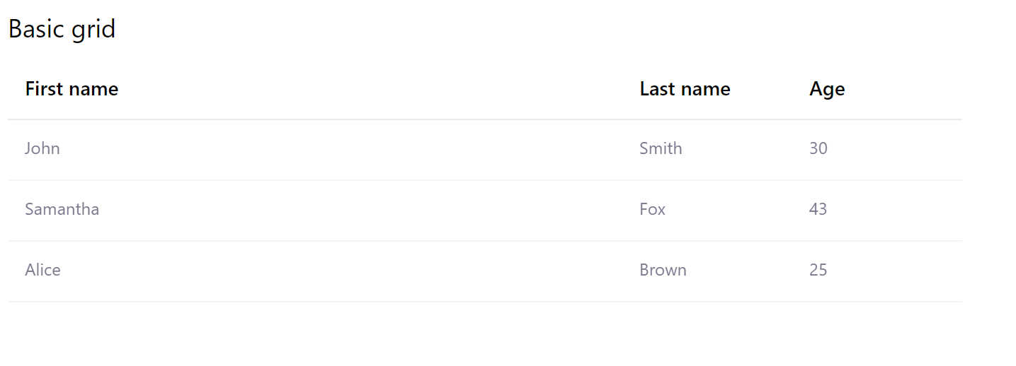
Basic grid
- Python
- PowerShell
import pglet
from pglet import Column, Grid, Stack, Text


class Person:
    def __init__(
        self, first_name: str, last_name: str, age: int = None, employee: bool = False
    ):
        self.first_name = first_name
        self.last_name = last_name
        self.age = age
        self.employee = employee


with pglet.page("basic-grid") as page:

    page.add(
        Text("Basic grid", size="large"),
        Stack(
            width="50%",
            controls=[
                Grid(
                    columns=[
                        Column(name="First name", field_name="first_name"),
                        Column(name="Last name", field_name="last_name"),
                        Column(name="Age", field_name="age"),
                    ],
                    items=[
                        Person(first_name="John", last_name="Smith", age=30),
                        Person(first_name="Samantha", last_name="Fox", age=43),
                        Person(first_name="Alice", last_name="Brown", age=25),
                    ],
                )
            ],
        ),
    )
# TODO
Sortable grid
- Python
- PowerShell
import pglet
from pglet import Column, Grid, Text


class Person:
    def __init__(
        self, first_name: str, last_name: str, age: int = None, employee: bool = False
    ):
        self.first_name = first_name
        self.last_name = last_name
        self.age = age
        self.employee = employee


with pglet.page("sortable-grid") as page:

    page.add(
        Text("Sortable grid with resizable columns and selectable rows", size="large"),
        Grid(
            selection_mode="single",
            preserve_selection=True,
            columns=[
                Column(
                    resizable=True,
                    sortable="string",
                    name="First name",
                    field_name="first_name",
                ),
                Column(
                    resizable=True,
                    sortable="string",
                    sorted="asc",
                    name="Last name",
                    field_name="last_name",
                ),
                Column(resizable=True, sortable="number", name="Age", field_name="age"),
            ],
            items=[
                Person(first_name="John", last_name="Smith", age=30),
                Person(first_name="Samantha", last_name="Fox", age=43),
                Person(first_name="Alice", last_name="Brown", age=25),
            ],
        ),
    )
# TODO

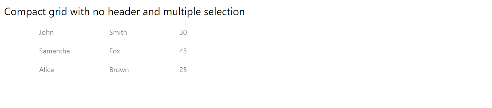
Compact grid
- Python
- PowerShell
import pglet
from pglet import Column, Grid, Text


class Person:
    def __init__(
        self, first_name: str, last_name: str, age: int = None, employee: bool = False
    ):
        self.first_name = first_name
        self.last_name = last_name
        self.age = age
        self.employee = employee


with pglet.page("compact-grid") as page:

    page.add(
        page.add(
            Text("Compact grid with no header and multiple selection", size="large"),
            Grid(
                compact=True,
                header_visible=False,
                selection_mode="multiple",
                preserve_selection=True,
                columns=[
                    Column(max_width=100, field_name="first_name"),
                    Column(max_width=100, field_name="last_name"),
                    Column(max_width=100, field_name="age"),
                ],
                items=[
                    Person(first_name="John", last_name="Smith", age=30),
                    Person(first_name="Samantha", last_name="Fox", age=43),
                    Person(first_name="Alice", last_name="Brown", age=25),
                ],
            ),
        )
    )
# TODO
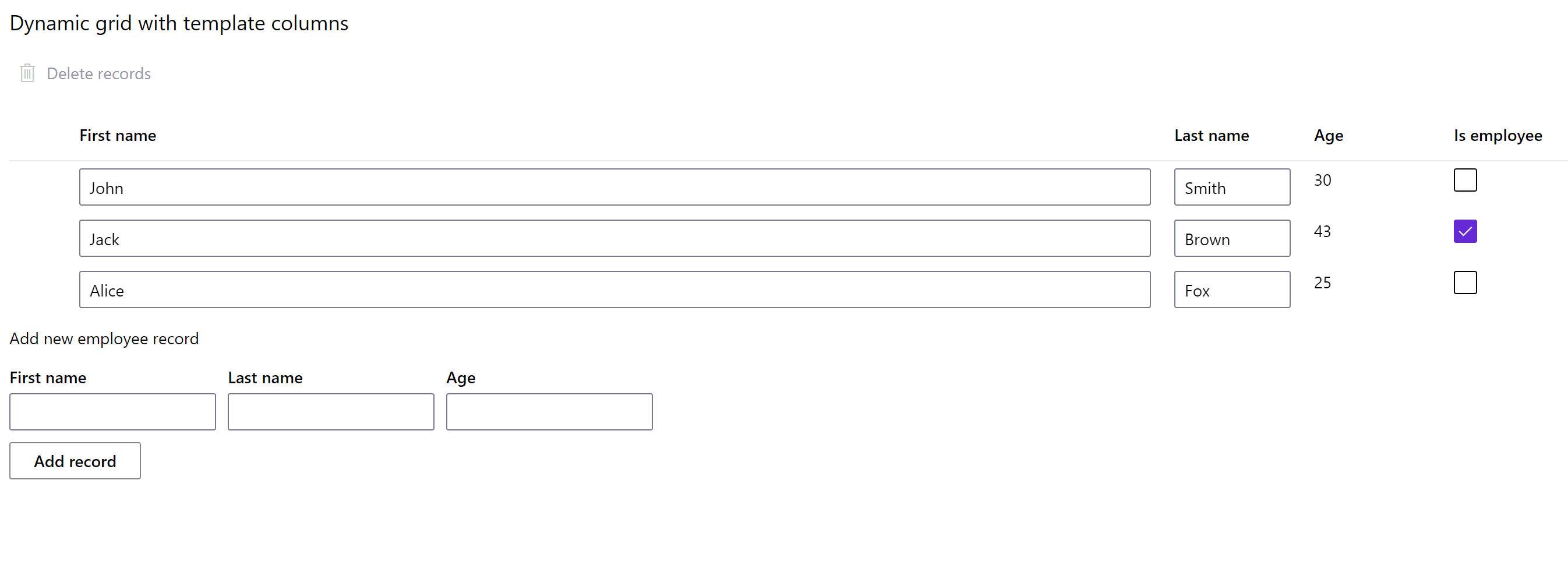
Dynamic grid
- Python
- PowerShell
import pglet
from pglet import Button, Checkbox, Column, Grid, Stack, Text, Textbox, Toolbar, toolbar


class Person:
    def __init__(
        self, first_name: str, last_name: str, age: int = None, employee: bool = False
    ):
        self.first_name = first_name
        self.last_name = last_name
        self.age = age
        self.employee = employee


with pglet.page("dynamic-grid") as page:

    grid = None

    def delete_records(e):
        for r in grid.selected_items:
            grid.items.remove(r)
        page.update()

    delete_records = toolbar.Item(
        text="Delete records", icon="Delete", disabled=True, on_click=delete_records
    )
    grid_toolbar = Toolbar(items=[delete_records])

    def grid_items_selected(e):
        delete_records.disabled = len(e.control.selected_items) == 0
        delete_records.update()

    grid = Grid(
        selection_mode="multiple",
        compact=True,
        header_visible=True,
        columns=[
            Column(
                name="First name", template_controls=[Textbox(value="{first_name}")]
            ),
            Column(name="Last name", template_controls=[Textbox(value="{last_name}")]),
            Column(name="Age", template_controls=[Text(value="{age}")]),
            Column(
                name="Is employee", template_controls=[Checkbox(value_field="employee")]
            ),
        ],
        items=[
            Person(first_name="John", last_name="Smith", age=30, employee=False),
            Person(first_name="Jack", last_name="Brown", age=43, employee=True),
            Person(first_name="Alice", last_name="Fox", age=25, employee=False),
        ],
        margin=0,
        on_select=grid_items_selected,
    )

    first_name = Textbox("First name")
    last_name = Textbox("Last name")
    age = Textbox("Age")

    def add_record(e):
        grid.items.append(
            Person(
                first_name=first_name.value,
                last_name=last_name.value,
                age=age.value,
                employee=True,
            )
        )
        first_name.value = ""
        last_name.value = ""
        age.value = ""
        page.update()

    page.add(
        Text("Dynamic grid with template columns", size="large"),
        grid_toolbar,
        grid,
        Text("Add new employee record", size="medium"),
        Stack(horizontal=True, controls=[first_name, last_name, age]),
        Button("Add record", on_click=add_record),
    )

    input()
# TODO
Properties
| Name | Type | Default | Description |
|---|---|---|---|
selection | string | none | Items selection mode: none, single or multiple. |
compact | bool | false | Whether to render Grid in a compact form. |
headerVisible | bool | true | Whether Grid header is visible. |
preserveSelection | bool | false | By default, selection is cleared when clicking on an empty (non-focusable) section of the screen. Setting this value to true overrides that behavior and maintains selection. |
shimmerLines | int | 0 | Whether to display shimmer lines if items collection is empty. 0 - do not display shimmer. |
Events
| Name | Description |
|---|---|
select | Fires when one or more Grid items are selected or de-selected. |
itemInvoke | Fires when Grid item is invoked with double-click or Enter. |
Child controls
Columns control
Serves as a container for column controls.
Child controls
Items control
Serves as a container for item controls.
Child controls
Column control
Describes Grid column.
Properties
| Name | Type | Default | Description |
|---|---|---|---|
name | string | Column header text. | |
icon | string | Column header icon next to the text. | |
iconOnly | bool | false | Display only header icon. |
fieldName | string | Item's property name to display in the column. | |
sortable | string | Whether client-side sorting is enabled for this column. Supported values: string - column is sortable as a string; number - column is sortable as a number; false or empty - column is not sortable. | |
sortField | string | Item's property name used for sorting. Sort by fieldName if not specified. | |
sorted | string | false | Whether the items are sorted by sortField or fieldName and in what direction. Supported values: false (unsorted), asc or desc. |
resizable | bool | false | Whether the column is resizable. |
minWidth | number | Minimum width of the column. | |
maxWidth | number | Maximum width of the column. | |
onClick | bool | false | Whether column header is clickable. |
Events
| Name | Description |
|---|---|
click | Fires when Grid column is clicked. |
Child controls
Any controls to enable template column.
Item control
Item control holds the data for a single row.
Properties
Item control can have any properties.