DatePicker
A date picker (DatePicker) offers a drop-down control that’s optimized for picking a single date from a calendar view where contextual information like the day of the week or fullness of the calendar is important.
Examples
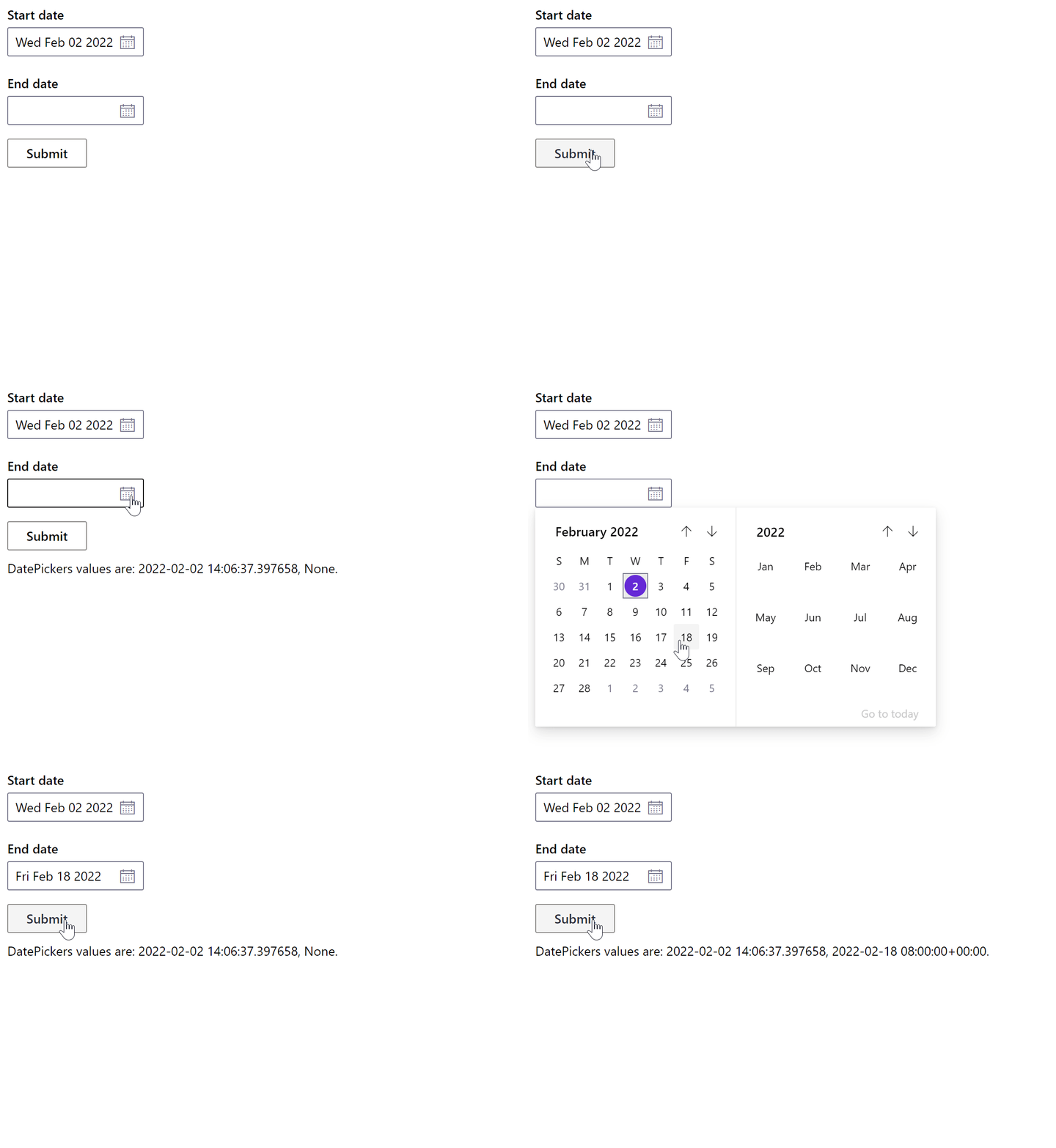
Basic DatePicker
- Python
- PowerShell
from datetime import datetime
import pglet
from pglet import DatePicker, Button, Text
with pglet.page("basic-datepicker") as page:
  def button_clicked(e):
    t.value = f"DatePickers values are:  {dp1.value}, {dp2.value}."
    page.update()

  now = datetime.now()
  t = Text()
  b = Button(text='Submit', on_click=button_clicked)
  dp1 = DatePicker(label="Start date", value=now, width=150)
  dp2 = DatePicker(label="End date", width=150)

  page.add(dp1, dp2, b, t)
  input()
# TODO

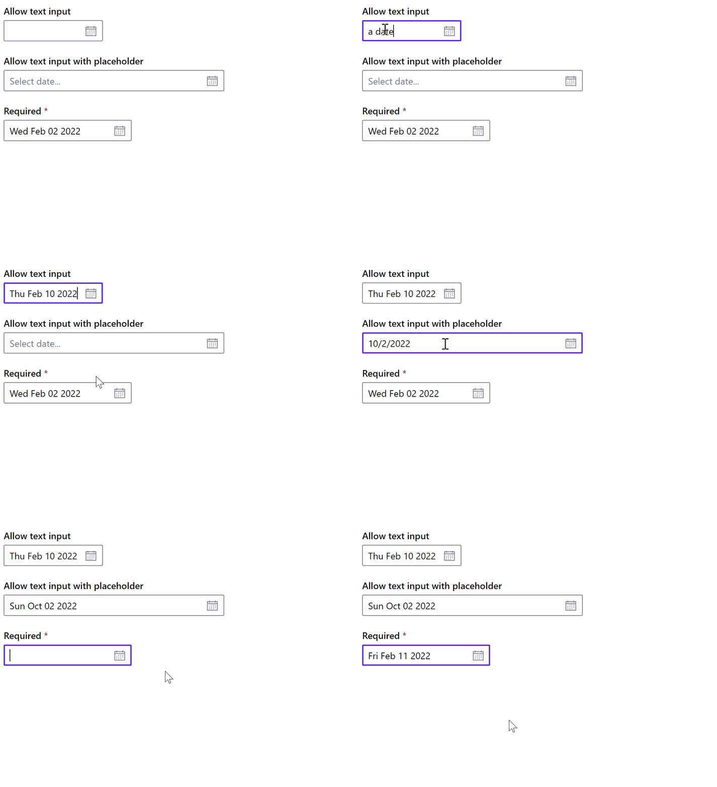
DatePicker with text input allowed
- Python
- PowerShell
from datetime import datetime
import pglet
from pglet import DatePicker
with pglet.page("datepicker-allow-text-input") as page:
  now = datetime.now()
  page.add(
    DatePicker(width=150, label="Allow text input", allow_text_input=True),
    DatePicker(label="Allow text input with placeholder", placeholder='Select date...', allow_text_input=True, width='25%'),
    DatePicker(value=now, label="Required", required=True, allow_text_input=True))
# TODO

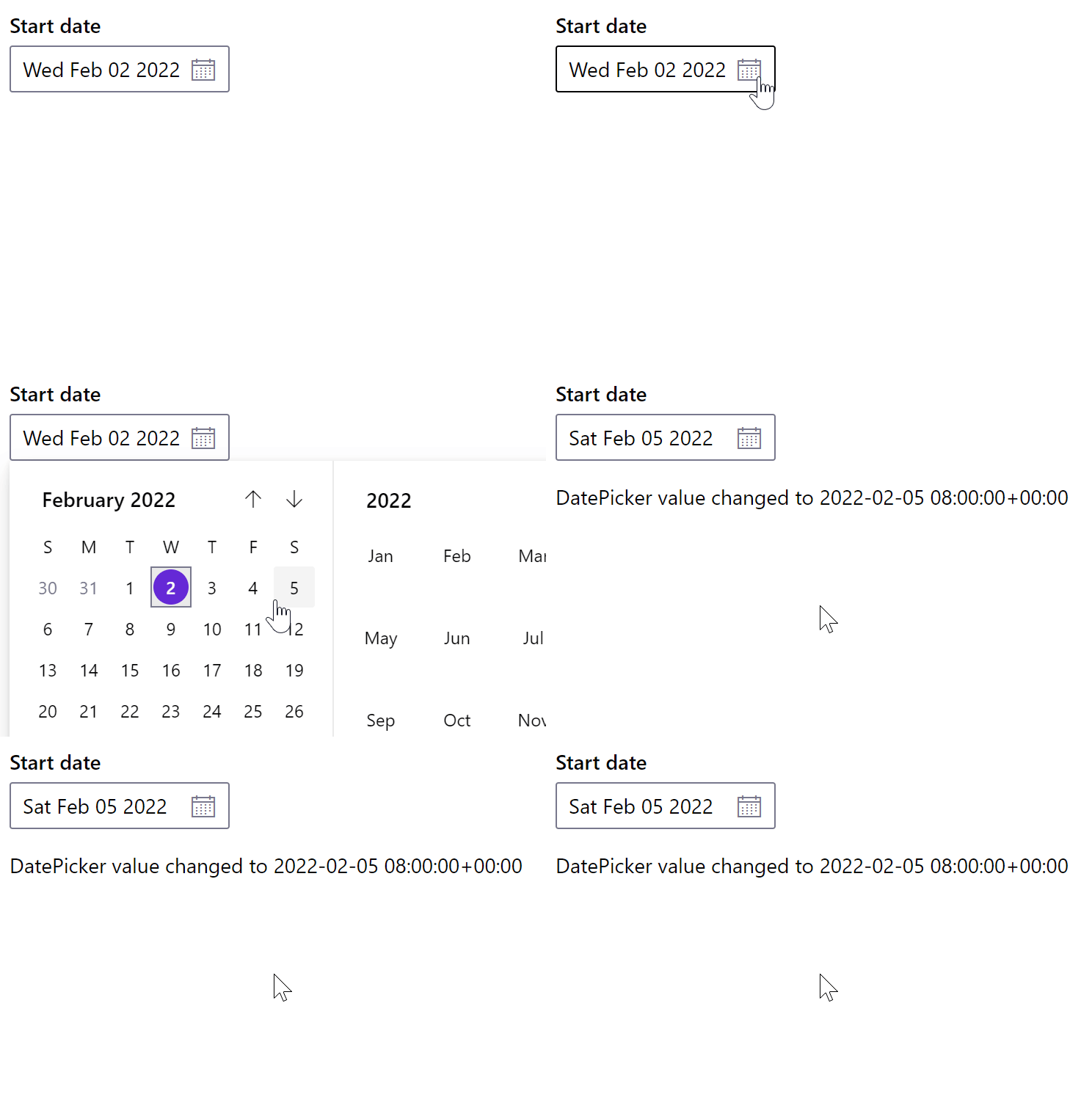
DatePicker with change event
- Python
- PowerShell
from datetime import datetime
import pglet
from pglet import DatePicker, Text
with pglet.page("datepicker-with-change-event") as page:
  def datepicker_changed(e):
        t.value = f"DatePicker value changed to {dp.value}"
        t.update()

  now = datetime.now()
  t = Text()
  dp = DatePicker(label="Start date", value=now, width=150, on_change=datepicker_changed)

  page.add(dp, t)
  input()
# TODO

Properties
| Name | Type | Default | Description |
|---|---|---|---|
value | date | Current value of the DatePicker. | |
label | string | Label to display above the DatePicker. | |
placeholder | string | The short hint displayed in the DatePicker before the user enters a value. | |
required | bool | false | Display DatePicker as required. |
allowTextInput | bool | false | Whether the DatePicker allows input a date string directly or not. |
borderless | bool | false | Whether or not the DatePicker is borderless. |
underlined | bool | false | Whether or not the DatePicker is underlined. |
focused | bool | false | When set to true the focus is set on the control when it's shown on the page or page opened. |
Events
| Name | Description |
|---|---|
change | Fires when the selected date is changed (either selected from dropdown or entered if allowTextInput is enabled.) |
focus | Fires when the control has received focus. |
blur | Fires when the control has lost focus. |