Slider
A slider provides a visual indication of adjustable content, as well as the current setting in the total range of content. Use a slider when you want people to set defined values (such as volume or brightness), or when people would benefit from instant feedback on the effect of setting changes.
Examples
Basic sliders
- Python
- PowerShell
import pglet
from pglet import Slider
with pglet.page("basic-sliders") as page:
  page.add(
    Slider(label='Default slider'),
    Slider(label='Default disabled slider', disabled=True))
# TODO

Sliders with values
- Python
- PowerShell
import pglet
from pglet import Slider, Button, Text
with pglet.page("sliders-with-values") as page:

  def button_clicked(e):
        t.value = f"Sliders values are:  {s1.value}, {s2.value}, {s3.value}."
        page.update()

  t = Text()
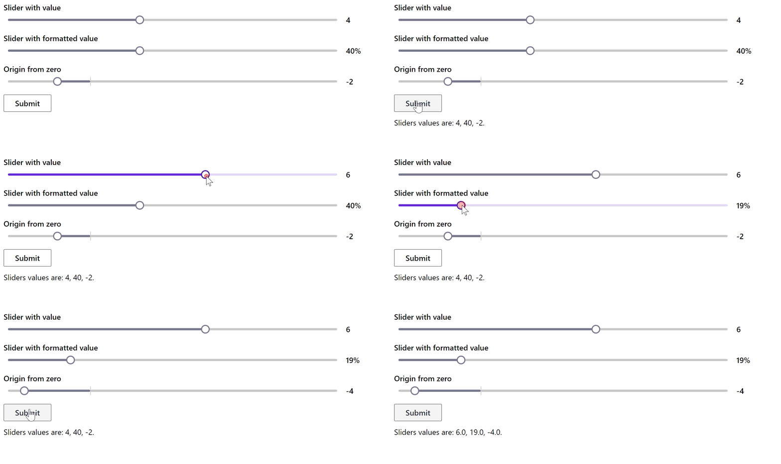
  s1 = Slider(width='50%', label='Slider with value', show_value=True, value=4)
  s2 = Slider(width='50%', label='Slider with formatted value', show_value=True, min=0, max=100, value=40, value_format='{value}%')
  s3 = Slider(width='50%', show_value=True, label='Origin from zero', min=-5, max=15, step=1, value=-2)

  b = Button(text='Submit', on_click=button_clicked)
  page.add(s1, s2, s3, b, t)

  input()
# TODO

Slider with change event
- Python
- PowerShell
import pglet
from pglet import Slider, Text
with pglet.page("slider-with-change-event") as page:

  def slider_changed(e):
    t.value = f"Slider changed to {int(s.value)}"
    page.update()

  t = Text()
  s = Slider(width='50%', label="Slider with 'change' event", on_change=slider_changed, data=0)

  page.add(s, t)

  input()
# TODO

Properties
| Name | Type | Default | Description |
|---|---|---|---|
value | number | Current value of the slider. | |
label | string | Description label of the slider. | |
min | number | The min value of the slider. | |
max | number | The max value of the slider. | |
step | number | The difference between the two adjacent values of the slider. | |
showValue | bool | false | Whether to show the value on the right of the slider. |
valueFormat | string | {value} | Optional format string for the slider value, for example {value}%. |
vertical | bool | false | Optional flag to render the slider vertically. Defaults to rendering horizontal. |
focused | bool | false | When set to true the focus is set on the control when it's shown on the page or page opened. |
data | string | Additional data attached to the control. The value is passed in change event data along with a slider value. |
Events
| Name | Description |
|---|---|
change | Fires when the value of a slider has been changed. |
focus | Fires when the control has received focus. |
blur | Fires when the control has lost focus. |